art essay
Introduction: This assignment spent me almost whole term. The theme of the painting is abstract. We used Chinese calligraphy to talk about one story.
Reflection: This was my first time I so worried about art. My teacher was a French woman, she thought we were all little artist so she used very high standerd teach us. This was also my first to draw abstract painting, at first I nearly don't know what should I draw. Although I put many energy on art this term and it was very tired, I learnt how to make one diagram abstract, how to manage colors and how to find the balance between the calligraphy and the background. My calligraphy is good but I didn't find the balance for my background, it looks too thin. If I can have a chance to fix it, I will try to make my background better.
Reflection: This was my first time I so worried about art. My teacher was a French woman, she thought we were all little artist so she used very high standerd teach us. This was also my first to draw abstract painting, at first I nearly don't know what should I draw. Although I put many energy on art this term and it was very tired, I learnt how to make one diagram abstract, how to manage colors and how to find the balance between the calligraphy and the background. My calligraphy is good but I didn't find the balance for my background, it looks too thin. If I can have a chance to fix it, I will try to make my background better.
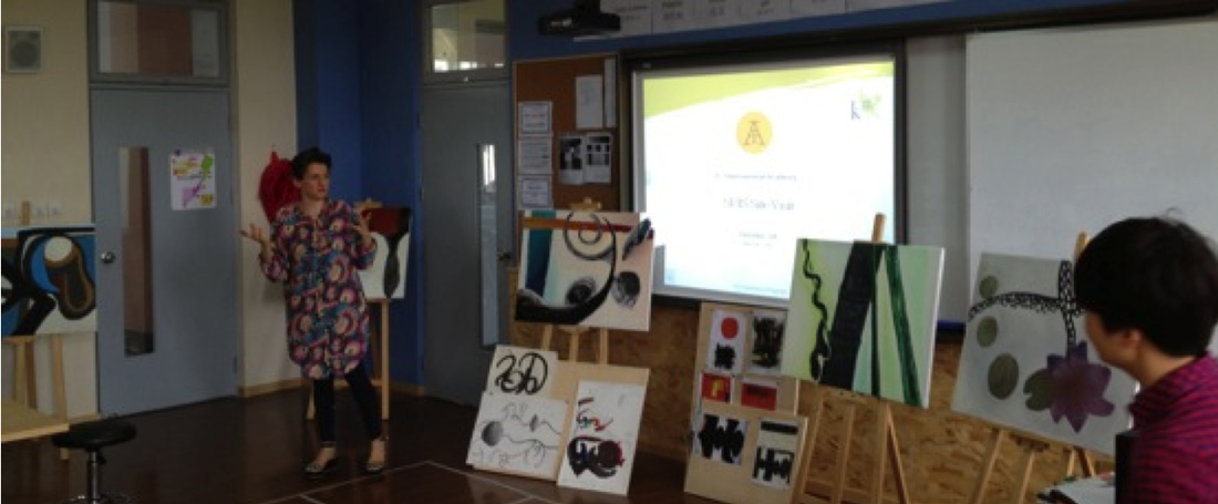
The teacher in the middle was our art teacher. The painting on the left said of her with blue and orange is my painting.
art presentation
I used western big brushes and acrylic in my painting. My calligraphy is the front part of composition it is the darkest part. My middle part is the colorful part and the background. My calligraphy is on the right side and it means water. I use curly lines to represent the water. I do the gradation at the bottom part. The color is from darker to lighter. The curly line of the left side of the word is wave. There is a strong dot at the bottom. I used variation in calligraphy part, I tried to make different parts of the calligraphy looks different so there are thick lines, thin lines, very dark lines, grey and dotted lines in my work.
It is the people. People fight for their home to the big flood. I put the dot on the water means people finally win. There are two ovals one is thinner and one is bigger it is a kind of contrast. These two ovals represent the water-drop.
The concept of my painting is about the flood. We can see the progress from the danger to peace. It is represented by darker color to lighter color.
Now I will talk about the color part. There are two colorful lines in my painting. One is for the sun shine and one is for the flood. I will first talk about the sun shine line. I use orange to be the bottom color. At the right side I add brown first to make is darker and then I add a little purple in it to make feel sadder. At the left side I add lighter color in it like light yellow and white to feel it is warm. Then I will talk about the flood line. I use light blue, dark blue, green and yellow. It means at first the flood is very dangerous so I choose the dark color then the color turn to lighter it means finally people defeat the flood is the sea turn to normal so the color become lighter.
The hardest part is about the background. From the example teacher gave us we can find the background isn’t pure white. There were some shadows in the background to make the whole painting more 3D. At first I had no idea on how to deal with the background. I mixed one cream-color first but it was too dark so I add more white in it to make the color look softer. Since there are two colored lines in my painting so my background have to have some link to the calligraphy and these two lines. Gradation is one of the most important skills in this part. In the middle there is one part of calligraphy which in wave-shaped and this part is connected with the sun-shine part so I mixed one special yellow paint it from darker to lighter. I make this part just like the sunshine. Since there are two main colors in my painting they are blue and yellow, I have to find one connection between these two colors in background. Beside the blue part I used very light blue add green and yellow and also some earthy yellow to be this part’s background. Because the gradation, the blue part’s background I also paint it from darker to light. I thought maybe I can paint the yellow part from darker to lighter then connect to the water part from lighter to darker. Since I used very strong color in right side to keep the balance I also use some darker color to make the right side background stronger. At first the background was too flat so I drew different layers again and again to make the background part thicker.
